
티스토리 뷰
저번글에서는 JSX의 정의, 변수선언 방법, Component, Props,Status 에 대한 기본적인 사용방법에 대해 알아봤습니다.
https://marshmello.tistory.com/70
React Native UI 구성 및 문법 1
저번글에서는 개발환경을 구축하고, 리액트 네이티브 프로젝트를 생성하였습니다. https://marshmello.tistory.com/69?category=1213283 React Native 설치 및 프로젝트 생성하기 저번글에서는 리액트 네이티브가
marshmello.tistory.com
이번글에서는 리액트 네이티브의 이벤트, 스타일링에 대해 작성해보겠습니다.
1. 이벤트
리액트 네이티브는 사용자의 행동에 따라 상호 작용하는 이벤트를 다양하게 제공합니다. 정말 많은 이벤트가 있으며 컴포넌트가 하는 역할에 따라 제공되는 이벤트도 약간씩 차이가 있습니다.
- React의 이벤트는 소문자 대신 카멜 케이스(camelCase)를 사용합니다.
- JSX를 사용하여 문자열이 아닌 함수로 이벤트 핸들러를 전달합니다.
예를 들어, HTML은 다음과 같습니다.
<button onclick="activateLasers()">
  Activate Lasers
</button>
React에서는 약간 다릅니다.
<button onClick={activateLasers}>
  Activate Lasers
</button>
또 다른 차이점으로, React에서는 false를 반환해도 기본 동작을 방지할 수 없습니다. 반드시 preventDefault를 명시적으로 호출해야 합니다. 예를 들어, 일반 HTML에서 폼을 제출할 때 가지고 있는 기본 동작을 방지하기 위해 다음과 같은 코드를 작성할 수 있습니다.
<form onsubmit="console.log('You clicked submit.'); return false">
  <button type="submit">Submit</button>
</form>
React에서는 다음과 같이 작성할 수 있습니다.
function Form() {
  function handleSubmit(e) {
    e.preventDefault();
    console.log('You clicked submit.');
  }

  return (
    <form onSubmit={handleSubmit}>
      <button type="submit">Submit</button>
    </form>
  );
}
여기서 e는 합성 이벤트입니다. React는 W3C 명세에 따라 합성 이벤트를 정의하기 때문에 브라우저 호환성에 대해 걱정할 필요가 없습니다. React 이벤트는 브라우저 고유 이벤트와 정확히 동일하게 동작하지는 않습니다. 더 자세한 사항은 합성 이벤트을 참고하시기 바랍니다.
React를 사용할 때 DOM 엘리먼트가 생성된 후 리스너를 추가하기 위해 addEventListener를 호출할 필요가 없습니다. 대신, 엘리먼트가 처음 렌더링될 때 리스너를 제공하면 됩니다.
ES6 클래스를 사용하여 컴포넌트를 정의할 때, 일반적인 패턴은 이벤트 핸들러를 클래스의 메서드로 만드는 것입니다. 예를 들어, 다음 Toggle 컴포넌트는 사용자가 “ON”과 “OFF” 상태를 토글 할 수 있는 버튼을 렌더링합니다.
class Toggle extends React.Component {
  constructor(props) {
    super(props);
    this.state = {isToggleOn: true};

    // 콜백에서 `this`가 작동하려면 아래와 같이 바인딩 해주어야 합니다.
    this.handleClick = this.handleClick.bind(this);
  }

  handleClick() {
    this.setState(prevState => ({
      isToggleOn: !prevState.isToggleOn
    }));
  }

  render() {
    return (
      <button onClick={this.handleClick}>
        {this.state.isToggleOn ? 'ON' : 'OFF'}
      </button>
    );
  }
}

ReactDOM.render(
  <Toggle />,
  document.getElementById('root')
);
https://codepen.io/gaearon/pen/xEmzGg?editors=0010
Toggle
...
codepen.io
JSX 콜백 안에서 this의 의미에 대해 주의해야 합니다. JavaScript에서 클래스 메서드는 기본적으로 바인딩되어 있지 않습니다. this.handleClick을 바인딩하지 않고 onClick에 전달하였다면, 함수가 실제 호출될 때 this는 undefined가 됩니다.
이는 React만의 특수한 동작이 아니며, JavaScript에서 함수가 작동하는 방식의 일부입니다. 일반적으로 onClick={this.handleClick}과 같이 뒤에 ()를 사용하지 않고 메서드를 참조할 경우, 해당 메서드를 바인딩 해야 합니다.
만약 bind를 호출하는 것이 불편하다면, 이를 해결할 수 있는 두 가지 방법이 있습니다. 실험적인 퍼블릭 클래스 필드 문법을 사용하고 있다면, 클래스 필드를 사용하여 콜백을 올바르게 바인딩할 수 있습니다.
class LoggingButton extends React.Component {
  // 이 문법은 `this`가 handleClick 내에서 바인딩되도록 합니다.
  // 주의: 이 문법은 *실험적인* 문법입니다.
  handleClick = () => {
    console.log('this is:', this);
  }

  render() {
    return (
      <button onClick={this.handleClick}>
        Click me
      </button>
    );
  }
}
만약 클래스 필드 문법을 사용하고 있지 않다면, 콜백에 화살표 함수를 사용하는 방법도 있습니다.
class LoggingButton extends React.Component {
  handleClick() {
    console.log('this is:', this);
  }

  render() {
    // 이 문법은 `this`가 handleClick 내에서 바인딩되도록 합니다.
    return (
      <button onClick={() => this.handleClick()}>
        Click me
      </button>
    );
  }
}
이 문법의 문제점은 LoggingButton이 렌더링될 때마다 다른 콜백이 생성된다는 것입니다. 대부분의 경우 문제가 되지 않으나, 콜백이 하위 컴포넌트에 props로서 전달된다면 그 컴포넌트들은 추가로 다시 렌더링을 수행할 수도 있습니다. 이러한 종류의 성능 문제를 피하고자, 생성자 안에서 바인딩하거나 클래스 필드 문법을 사용하는 것을 권장합니다.
루프 내부에서는 이벤트 핸들러에 추가적인 매개변수를 전달하는 것이 일반적입니다. 예를 들어, id가 행의 ID일 경우 다음 코드가 모두 작동합니다.
<button onClick={(e) => this.deleteRow(id, e)}>Delete Row</button>
<button onClick={this.deleteRow.bind(this, id)}>Delete Row</button>
위 두 줄은 동등하며 각각 화살표 함수와 Function.prototype.bind를 사용합니다.
두 경우 모두 React 이벤트를 나타내는 e 인자가 ID 뒤에 두 번째 인자로 전달됩니다. 화살표 함수를 사용하면 명시적으로 인자를 전달해야 하지만 bind를 사용할 경우 추가 인자가 자동으로 전달됩니다.
1) 버튼 이벤트
많은 이벤트가 있지만 웹프로그래밍에서 가장 많이 사용하는 이벤트 중 하나는 특정 DOM을 클릭했을때 호출되는 onClick 이벤트 일 것입니다. 리액트 네이티브에서 onClick 버튼이벤트와 가장 비슷한 이벤트는 press 이벤트 입니다.
버튼을 만들때 사용하는 TouchableOpacity 컴포넌트에서 설정할 수 있는 Press 이벤트의 종류는 총 4가지 입니다.
onPressIn: 터치가 시작될 때 항상 호출
onPressOut: 터치가 해제될 때 항상 호출
onPress: 터치가 해제될 때 onPressOut 이후 호출
onLongPress: 터치가 일정 시간 이상 지속되면 호출
2) change 이벤트
변화를 감지하는 이벤트인 change 이벤트는 값을 입력하는 TextInput 컴포넌트에서 많이 사용됩니다.
https://reactnative.dev/docs/textinput
TextInput · React Native
A foundational component for inputting text into the app via a keyboard. Props provide configurability for several features, such as auto-correction, auto-capitalization, placeholder text, and different keyboard types, such as a numeric keypad.
reactnative.dev
예시 소스
import React, { useState } from "react";
import { StyleSheet, TextInput, Text, View } from 'react-native';
const EventInput = () => {
    const [text, setText] = useState('');
    const _onChange = event => setText(event.nativeEvent.text);

    return (
        <View>
            <Text style={styles.text}>text : {text}</Text>
            <TextInput
                style={styles.input}
                onChange={_onChange}
                placeholder="Enter a text.........." />
        </View>
    );
};


const styles = StyleSheet.create({
    text: {
        margin: 10,
        fontSize: 30
    },
    input: {
        borderWidth: 1,
        padding: 10,
        fontSize: 20
    },
});
export default EventInput;
결과물

TextInput 컴포넌트에 있는 onChange 속성은 TextInput 컴포넌트에 입력된 텍스트가 변경될 떄 호출됩니다. 그리고 호출되는 함수에 다음과 같은 형태로 인자를 전달합니다.
{
...,
nativeEvent: {
	eventCount : ...,
	target: ...,
	text:...,
  },
...
}
우리는 변화된 텍스트를 출력해야 하므로 위 코드처럼 event.nativeEvent.text를 setText함수에 전달해야 우리가 원하는 변화된 텍스트를 text 상태에 저자할 수 있습니다.
onChange 를 통해 전달되는 내용 중 우리에게 필요한 것은 변화된 텍스트뿐입니다. onChangeText는 이런 상황에서 조금 더 간편하게 사용할 수 있습니다. onChageText는 컴포넌트의 텍스트가 변경되었을때 변경된 테스트의 문자열만 인수로 전달하며 호출됩니다.
 const _onChange = text => setText(text);

    return (
        <View>
            <Text style={styles.text}>text : {text}</Text>
            <TextInput
                style={styles.input}
                onChangeText={_onChange}
                placeholder="Enter a text.........." />
        </View>
    );
};
3) Pressable 컴포넌트
리액트네이티브 0.63버전부터 기존의 TouchableOpacity 컴포넌트를 대체하는 Pressable 컴포넌트가 추가되었습니다.
https://reactnative.dev/docs/pressable
Pressable · React Native
Pressable is a Core Component wrapper that can detect various stages of press interactions on any of its defined children.
reactnative.dev
기존의 컴포넌트보다 더 다양한 기능을 제공하므로 리액트 네이티브 0.63버전 이상을 사용해서 Pressable 컴포넌트를 사용할 수 있는 분은 TouchableOpacity 컴포넌트 대신 Pressable 컴포넌트를 사용하시길 권합니다.
* 버전확인 명령어
react-native info
이 Pressable 컴포넌트는 TouchableOpacity 컴포넌트처럼 사용자의 터치에 상호작용하는 컴포넌트입니다. press 이벤트도 동일하게 존재하고 동작 방식도 같습니다. Pressable 컴포넌트에서 지원하는 기능 중 기존의 컴포넌트들과 다른 특징은 HitRect와 PressRech입니다.
우리가 앱을 모바일로 사용할때 화면이 작은만큼 버튼도 작아지는데 사람마다 손의크기나 두꼐가 모두 달라 클릭을 정확하게 하는것이 어려울수가 있습니다. 이경우 의도치않게 버튼을 클릭하거나 버튼을 클릭하는것 자체를 어려운 경우가 있습니다. 이 경우를 해결하기 위해 버튼모양보다 약간 떨어진 부분까지 이벤트가 발생하도록 조치하고 있습니다. Pressable 컴포넌트에서는 HitRect를 이용해 이 설정을 쉽게 할 수 있습니다.
누구나 한번쯤 버튼을 한번 클릭했을 때 해당 버튼이 동작하지 않게 하기위해 버튼을 누른상태에서 손가락을 이동시킨 경험이 있을 것 입니다. 이 이동범위가 얼마인지 아는 개발자는 잘 없습니다. Pressable 컴포넌트에서는 이 부분도 개발자가 조절가능하도록 PressRect 기능을 지원합니다.
Pressable 컴포넌트를 실습하기 위해 다음 명령어를 이용해 새로운 프로젝트를 생성합니다.
npx react-native init RNPressable
비쥬얼스튜디오 코드에서 생성한 폴더를 엽니다.
App.js를 다음과 같이 수정합니다.
import React from 'react';
import {View, Text, Pressable} from 'react-native';

const Button = (props) => {
  return (
    <Pressable
      style={{padding: 10, backgroundColor: '#1abc9c'}}
      onPressIn={() => console.log('Press In')}
      onPressOut={() => console.log('Press Out')}
      onPress={() => console.log('Press')}
      onLongPress={() => console.log('Long Press')}
      delayLongPress={3000}
      pressRetentionOffset={{bottom: 50, left: 50, right: 50, top: 50}}
      hitSlop={50}>
      <Text style={{padding: 10, fontSize: 30}}>{props.title}</Text>
    </Pressable>
  );
};

const App = () => {
  return (
    <View
      style={{
        flex: 1,
        justifyContent: 'center',
        backgroundColor: '#fff',
        alignItems: 'center',
      }}>
      <Button title="Pressable" />
    </View>
  );
};

export default App;
AVD를 실행 한 후 아래의 명령어를 입력합니다.
npm run android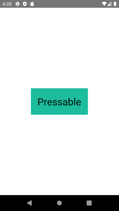
버튼에서 조금 떨어져 있어도 클릭되고 버튼을 누른상태에서 이동했을 때 항상 같은 위치에서 onPressOut이 호출되는것을 확인할수 있습니다. PRessRect의 범위는 HitRect의 범위 끝에서부터 시작되므로 hitSlop의 값에따라 PressRect의 범위가 달라진다는 것을 기억하시기 바랍니다.
2. 조건부
React에서 조건부 렌더링은 JavaScript에서의 조건 처리와 같이 동작합니다. if 나 조건부 연산자 와 같은 JavaScript 연산자를 현재 상태를 나타내는 엘리먼트를 만드는 데에 사용하세요. 그러면 React는 현재 상태에 맞게 UI를 업데이트할 것입니다.
1) if 조건문
JSX는 if문을 내부에서만 사용할 수 있으며, 즉시실행함수 형태로 작성해야한다는 조건이 있습니다.
형식
  {
      (function(){
			...if조건문...
	  })
}
예시
function App() {
  const word = 'react';
  return (
    <div>
    {
      (()=>{
        if(word == 'react'){
          return '리액트';
        }else
         return '리액트가 아닙니다.';
        }
      })()
    }
    </div>
  );
}
2) 삼항연상자
형식
{조건식 ? 참일때실행됨 : 거짓일때실행됨}예시1
function App() {
  const name = '마시멜로';
  return (
    name === '마시멜로' ? <div>TRUE</div> : <div>FALSE</div>
  );
}
예시2
export default function App() {
const name ='마시멜로';
  return (
    <View style={styles.container}>
      <Text>이 블로그는 {name === '마시멜로'? '좋은':'더 좋은'} 입니다</Text>
      <StatusBar style="auto" />
    </View>
  );
}
3) null
조건에 따라 출력값을 보면 컴포넌트가 null 또는 undefined를 반환할 때가 있습니다. JSX는 이 경우 null은 오류가 발생하지 않지만 undefined는 오류가 발생합니다.
//허용
export default function App() {
  return null;
 }
//에러 발생!
export default function App() {
return undefined;
}4) 주석
자바스크립트와는 달리 JSX에서의 주석은 반드시 대괄호{} 안에 // 또는 /* */ 주석 을 사용할 수 있습니다.
단 태그안에서는 대괄호 없이 사용가능합니다.
예시
export default function App() {
  return (

    <View style={styles.container}>
      {/* 주석테스트*/}
      <Text //주석테스트
      > Open up App.js to start working on your app!</Text>
      <StatusBar style="auto" />
    </View>
  );
}
아래 두 컴포넌트가 있다고 가정해 봅시다.
function UserGreeting(props) {
  return <h1>Welcome back!</h1>;
}

function GuestGreeting(props) {
  return <h1>Please sign up.</h1>;
}
이제 사용자의 로그인 상태에 맞게 위 컴포넌트 중 하나를 보여주는 Greeting 컴포넌트를 만듭니다,
function Greeting(props) {
  const isLoggedIn = props.isLoggedIn;
  if (isLoggedIn) {
    return <UserGreeting />;
  }
  return <GuestGreeting />;
}

ReactDOM.render(
  // Try changing to isLoggedIn={true}:
  <Greeting isLoggedIn={false} />,
  document.getElementById('root')
);
이 예시는 isLoggedIn prop에 따라서 다른 인사말을 렌더링 합니다.
엘리먼트를 저장하기 위해 변수를 사용할 수 있습니다. 출력의 다른 부분은 변하지 않은 채로 컴포넌트의 일부를 조건부로 렌더링 할 수 있습니다.
로그아웃과 로그인 버튼을 나타내는 두 컴포넌트가 있다고 가정해 보세요.
function LoginButton(props) {
  return (
    <button onClick={props.onClick}>
      Login
    </button>
  );
}

function LogoutButton(props) {
  return (
    <button onClick={props.onClick}>
      Logout
    </button>
  );
}
아래의 예시에서는 LoginControl이라는 유상태 컴포넌트 를 만들 것입니다.
이 컴포넌트는 현재 상태에 맞게 <LoginButton />이나 <LogoutButton />을 렌더링합니다. 또한 이전 예시에서의 <Greeting />도 함께 렌더링합니다.
class LoginControl extends React.Component {
  constructor(props) {
    super(props);
    this.handleLoginClick = this.handleLoginClick.bind(this);
    this.handleLogoutClick = this.handleLogoutClick.bind(this);
    this.state = {isLoggedIn: false};
  }

  handleLoginClick() {
    this.setState({isLoggedIn: true});
  }

  handleLogoutClick() {
    this.setState({isLoggedIn: false});
  }

  render() {
    const isLoggedIn = this.state.isLoggedIn;
    let button;

    if (isLoggedIn) {
      button = <LogoutButton onClick={this.handleLogoutClick} />;
    } else {
      button = <LoginButton onClick={this.handleLoginClick} />;
    }

    return (
      <div>
        <Greeting isLoggedIn={isLoggedIn} />
        {button}
      </div>
    );
  }
}

function UserGreeting(props) {
  return <h1>Welcome back!</h1>;
}

function GuestGreeting(props) {
  return <h1>Please sign up.</h1>;
}

function Greeting(props) {
  const isLoggedIn = props.isLoggedIn;
  if (isLoggedIn) {
    return <UserGreeting />;
  }
  return <GuestGreeting />;
}

function LoginButton(props) {
  return (
    <button onClick={props.onClick}>
      Login
    </button>
  );
}

function LogoutButton(props) {
  return (
    <button onClick={props.onClick}>
      Logout
    </button>
  );
}

ReactDOM.render(
  <LoginControl />,
  document.getElementById('root')
);
https://codepen.io/gaearon/pen/QKzAgB?editors=0010
Element Variable Example
...
codepen.io
변수를 선언하고 if를 사용해서 조건부로 렌더링 하는 것은 좋은 방법이지만 더 짧은 구문을 사용하고 싶을 때가 있을 수 있습니다. 여러 조건을 JSX 안에서 인라인(inline)으로 처리할 방법 몇 가지를 아래에서 소개하겠습니다
논리 && 연산자로 If를 인라인으로 표현하기
JSX 안에는 중괄호를 이용해서 표현식을 포함 할 수 있습니다. 그 안에 JavaScript의 논리 연산자 &&를 사용하면 쉽게 엘리먼트를 조건부로 넣을 수 있습니다.
function Mailbox(props) {
  const unreadMessages = props.unreadMessages;
  return (
    <div>
      <h1>Hello!</h1>
      {unreadMessages.length > 0 &&
        <h2>
          You have {unreadMessages.length} unread messages.
        </h2>
      }
    </div>
  );
}

const messages = ['React', 'Re: React', 'Re:Re: React'];
ReactDOM.render(
  <Mailbox unreadMessages={messages} />,
  document.getElementById('root')
);
JavaScript에서 true && expression은 항상 expression으로 평가되고 false && expression은 항상 false로 평가됩니다.
따라서 && 뒤의 엘리먼트는 조건이 true일때 출력이 됩니다. 조건이 false라면 React는 무시합니다.
false로 평가될 수 있는 표현식을 반환하면 && 뒤에 있는 표현식은 건너뛰지만 false로 평가될 수 있는 표현식이 반환된다는 것에 주의해주세요. 아래 예시에서, <div>0</div>이 render 메서드에서 반환됩니다.
render() {
  const count = 0;
  return (
    <div>
      { count && <h1>Messages: {count}</h1>}
    </div>
  );
}
조건부 연산자로 If-Else구문 인라인으로 표현하기
엘리먼트를 조건부로 렌더링하는 다른 방법은 조건부 연산자인 condition ? true: false를 사용하는 것입니다.
아래의 예시에서는 짧은 구문을 조건부로 렌더링합니다.
render() {
  const isLoggedIn = this.state.isLoggedIn;
  return (
    <div>
      The user is <b>{isLoggedIn ? 'currently' : 'not'}</b> logged in.
    </div>
  );
}
가독성은 좀 떨어지지만, 더 큰 표현식에도 이 구문을 사용할 수 있습니다.
render() {
  const isLoggedIn = this.state.isLoggedIn;
  return (
    <div>
      {isLoggedIn
        ? <LogoutButton onClick={this.handleLogoutClick} />
        : <LoginButton onClick={this.handleLoginClick} />
      }
    </div>
  );
}
JavaScript와 마찬가지로, 가독성이 좋다고 생각하는 방식을 선택하면 됩니다. 또한 조건이 너무 복잡하다면 컴포넌트를 분리하기 좋을 때 일 수도 있다는 것을 기억하세요.
컴포넌트가 렌더링하는 것을 막기
가끔 다른 컴포넌트에 의해 렌더링될 때 컴포넌트 자체를 숨기고 싶을 때가 있을 수 있습니다. 이때는 렌더링 결과를 출력하는 대신 null을 반환하면 해결할 수 있습니다.
아래의 예시에서는 <WarningBanner />가 warn prop의 값에 의해서 렌더링됩니다. prop이 false라면 컴포넌트는 렌더링하지 않게 됩니다.
function WarningBanner(props) {
  if (!props.warn) {
    return null;
  }

  return (
    <div className="warning">
      Warning!
    </div>
  );
}

class Page extends React.Component {
  constructor(props) {
    super(props);
    this.state = {showWarning: true};
    this.handleToggleClick = this.handleToggleClick.bind(this);
  }

  handleToggleClick() {
    this.setState(state => ({
      showWarning: !state.showWarning
    }));
  }

  render() {
    return (
      <div>
        <WarningBanner warn={this.state.showWarning} />
        <button onClick={this.handleToggleClick}>
          {this.state.showWarning ? 'Hide' : 'Show'}
        </button>
      </div>
    );
  }
}

ReactDOM.render(
  <Page />,
  document.getElementById('root')
);
https://codepen.io/gaearon/pen/Xjoqwm?editors=0010
Preventing Component Rendering
...
codepen.io
컴포넌트의 render 메서드로부터 null을 반환하는 것은 생명주기 메서드 호출에 영향을 주지 않습니다. 그 예로 componentDidUpdate는 계속해서 호출되게 됩니다.
3. 스타일링
앞서 코드작성에서 느끼셨겠지만, 웹 프로그래밍에서 사용하는 CSS와는 약간이 차이가 있습니다. 예를 들어 background-color를 backgroundColor처럼 카멜 표기법으로 작성해야 하는것과 같이 리액트네이티브에서 알아둬야할 스타일링 규칙이 존재합니다.
아래의 명령어로 프로젝트를 생성합니다.
expo init react-native-style프로젝트가 생성되면 비쥬얼스튜디오 코드로 폴더를 열고 다음과 같이 프로젝트를 구성합니다.

src폴더 생성 -> App.js 파일 생성 후 원래 생성된 루트 App.js을 아래와 같이 편집합니다.
import App from './src/App';

export default  App;
RN에서는 자바스크립트를 이용해 스타일링을 할 수 있습니다. 컴포넌트에는 style 속석이 있고, 이 속성에 인라인 스타일을 적용하는 방법과 스타일시트에 정의된 스타일을 사용하는 방법이 있습니다.
인라인 스타일은 HTML의 인라인 스타일링처럼 컴포넌트에 직접 스타일을 입력하는 방식입니다. 다만 HTML에서는 문자열 형태로 스타일을 입력하지만, RN에서는 객체 형태로 전달해야 한다는 차이점이 있습니다.
src/App.js를 아래와 같이 편집합니다.
import React from 'react';
import { StyleSheet, Text, View } from 'react-native';


const App = () => {
    return (
        <View style={{
            flex: 1,
            backgroundColor: '#fff',
            alignItems: 'center',
            justifyContent: 'center'
        }}>
            <Text style={{ padding: 10, fontSize: 26, fontWeight: '600', color: 'black' }}>Inline Style</Text>
        </View>
    );
}

export default App;
편집후 프로젝트를 실행합니다.
expo start
클래스 스타일링은 컴포넌트의 태그에 직접 입력하는 방식이 아니라 스타일시트에 정의된 스타일을 사용하는 방법입니다. 스타일시트에 스타일을 정의하고 컴포넌트에서는 정의된 스타일의 이름으로 적용하는 클래스 스타일링 방법은 웹 프로그래밍에서 CSS클래스를 이용하는 방법과 유사합니다.
src/App.js 파일을 아래와 같이 수정합니다.
import React from 'react';
import { StyleSheet, Text, View } from 'react-native';


const App = () => {
    return (
        <View style={styles.container}>
            <Text style={styles.text}>Inline Style</Text>
        </View>
    );
}

const styles = StyleSheet.create({
    container: {
        flex: 1,
        backgroundColor: '#fff',
        alignItems: 'center',
        justifyContent: 'center',
    },
    text: {
        padding: 10, fontSize: 26, fontWeight: '600', color: 'black'
    },
});

export default App;
간단하게 화면을 확인하는 상황에서는 인라인 스타일을 사용하는 것이 편할 수 있지만, 코드가 깔끔하고 명확하다는 장점이 있기 떄문에 장기적으로 생각하면 클래스 스타일을 사용 하는 것이 관리 측면에서 유리합니다.
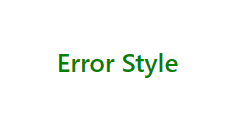
만약 여러개의 스타일을 적용해야할 경우 배열을 이용하여 style 속성에 여러개의 스타일을 적용합니다.
 <Text style={[styles.text, styles.error]}>Error Style</Text>
 ...
 const styles = StyleSheet.create({
    container: {
        flex: 1,
        backgroundColor: '#fff',
        alignItems: 'center',
        justifyContent: 'center',
    },
    text: {
        padding: 10, fontSize: 26, fontWeight: '600', color: 'black'
    },
    error: {
        fontWeight: '400', color: 'red'
    },
});
위와 같이 여러개의 스타일을 적용할 때 주의할 점은 적용하는 스타일의 순서입니다. 뒤에 오는 스타일이 앞에 있는 스타일을 덮는다는 것을 기억해야합니다. 만약 {[ styles.error , styles.text]} 로 작성하면 글자색이 검은색으로 변경됩니다.

여러개의 스타일을 적용하는 방식은 클래스 스타일만 적용하는 것은 아닙니다. 인라인 스타일과 클래스 스타일을 혼용해서 사용하는 방법도 있습니다.
<Text style={[styles.text, { color: 'green' }]}>Error Style</Text>
만약 커스텀 스타일을 다양한 곳에서 사용하고 싶은 경우 외부 파일에 스타일을 정의하고, 여러 개의 파일에서 스타일을 공통으로 사용할 수 있습니다. src 아래에 styles.js 파일을 아래와 같이 생성합니다.
import { StyleSheet } from 'react-native';

export const viewStyles = StyleSheet.create({
    container: {
        flex: 1,
        backgroundColor: '#fff',
        alignItems: 'center',
        justifyContent: 'center',
    }
});

export const textStyles = StyleSheet.create({
    text: {
        padding: 10, fontSize: 26, fontWeight: '600', color: 'black'
    },
    error: {
        fontWeight: '400', color: 'red'
    },
});
외부 스타일링 파일을 적용하기 위하여 src/App.js 파일을 아래와 같이 수정합니다.
import React from 'react';
import { Text, View } from 'react-native';
import { viewStyles, textStyles } from './styles';

const App = () => {
    return (
        <View style={viewStyles.container}>
            <Text style={[textStyles.text, { color: 'green' }]}>Error Style</Text>
        </View>
    );
}


export default App;
외부파일에 적용한 파일이 정상적으로 동작하는 것을 확인 할 수 있습니다.
RN에서 스타일을 적용하는 방법에 대해 알아보았습니다. 이번에는 스타일 속성들에 대해 알아보겠습니다.
RN에는 많은 종류의 스타일 속성들이 있습니다. 그중 특정 플랫폼에서만 적용되는 스타일도 있고 웹 프로그래밍에서 사용해본 속성들도 있습니다. 우선 자주 사용하는 속성들에 대해 알아보겠습니다.
화면의 범위를 정하는 속성에는 폭과 높이를 나타내는 width와 height가 있습니다. RN에서도 width와 height를 설정 할 수 있습니다.
src폴더 밑에 components 폴더를 생성하고 하위에 Layout.js 파일을 생성합니다.
import React from 'react';
import { StyleSheet, View, Text } from 'react-native';

export const Header = () => {
  return (
    <View style={[styles.container, styles.header]}>
      <Text style={styles.text}>Header</Text>
    </View>
  );
};

export const Contents = () => {
  return (
    <View style={[styles.container, styles.contents]}>
      <Text style={styles.text}>Contents</Text>
    </View>
  );
};

export const Footer = () => {
  return (
    <View style={[styles.container, styles.footer]}>
      <Text style={styles.text}>Footer</Text>
    </View>
  );
};

const styles = StyleSheet.create({
  container: {
    width: '100%',
    alignItems: 'center',
    justifyContent: 'center',
    height: 80,
  },
  header: {
    backgroundColor: '#f1c40f',
  },
  contents: {
    backgroundColor: '#1abc9c',
    height: 640,
  },
  footer: {
    backgroundColor: '#3498db',
  },
  text: {
    fontSize: 26,
  },
});
src/App.js를 다음과 같이 수정합니다.
import React from 'react';
import { Text, View } from 'react-native';
import { Header, Contents,Footer } from './components/Layout';
import { viewStyles, textStyles } from './styles';

const App = () => {
    return (
        <View style={viewStyles.container}>
          <Header/>
          <Contents/>
          <Footer/>
        </View>
    );
}


export default App;
Header 컴포넌트와 Footer 컴포넌트의 높이를 80으로 고정하고, Contents 컴포넌트가 나머지 영역을 차지하도록 640이라는 값으로 설정했습니다.하지만 고정값을 사용할 경우 기기마다 화면 크기의 차이가 발생하여 다양한 크기의 디바이스에 대응하지 못합니다. 이때 flex를 이용하여 문제를 해결할 수 있습니다. flex는 width,height와 달리 항상 비율로 크기가 설정됩니다. flex는 값으로 숫자를 받으며 값이 0일 때는 설정된 width나 height값에 다라 크기가 결정되고 , 양수인 경우 flex값에 비례하여 크기가 조정됩니다.
Layout.js파일을 아래와 같이 수정하여 1:2:1 비율로 나누어 봅시다.
const styles = StyleSheet.create({
  container: {
    width: '100%',
    alignItems: 'center',
    justifyContent: 'center',
  },
  header: {
    flex: 1,
    backgroundColor: '#f1c40f',
  },
  contents: {
    backgroundColor: '#1abc9c',
    flex: 2,
  },
  footer: {
    flex: 1,
    backgroundColor: '#3498db',
  },
  text: {
    fontSize: 26,
  },

화면을 구성하다가 보면 컴포넌트가 쌓이는 방향을 변경하고 싶을때가 있는데, 이때 flexDirection을 이용하면, 컴포넌트가 쌓이는 방향을 변경할 수 있습니다.
https://reactnative.dev/docs/flexbox
Layout with Flexbox · React Native
A component can specify the layout of its children using the Flexbox algorithm. Flexbox is designed to provide a consistent layout on different screen sizes.
reactnative.dev
flexDirection에 설정할 수 있는 값으로 네가지가 있습니다.
row
: 가로방향으로 정렬
플렉스 컨테이너의 주축이 글의 작성 방향과 동일합니다. 주축의 시작점과 끝점이 콘텐츠 방향과 동일합니다.
row-reverse
: 가로방향 역순 정렬
row와 동일하게 동작하지만 시작점과 끝점이 반대에 위치합니다.
column
: 세로방향으로 정렬(default)
플렉스 컨테이너의 주축이 블록 축과 동일합니다. 주축의 시작점과 끝점이, 글 작성 모드의 이전 지점 및 이후 지점과 동일합니다.
column-reverse
: 세로방향 역순정렬
column과 동일하게 동작하지만 시작점과 끝점이 반대에 위치합니다.
flexDirction은 자기 자신이 쌓이는 방향이 아니라 자식 컴포넌트가 쌓이는 방향을 설정합니다.
컴포넌트를 배치할 방향을 결정한 후 방향에 따라 정렬하는 방식을 결정하는 속성이 justifyContent와 alignItems입니다.
justifyContent는 flexDirction에서 결정한 방향과 동일한 방향으로 정렬하는 속성이고,
alignItems는 flexDirction에서 결정한 방향과 수직인 방향으로 정렬하는 속성입니다.
그림자는 RN에서 플랫폼마다 다르게 적용되는 스타일 속성입니다.
https://reactnative.dev/docs/shadow-props
Shadow Props · React Native
`SnackPlayer name=Shadow%20Props&supportedPlatforms=ios
reactnative.dev
그림자 속성은 4가지가 있습니다.
shadowColor : 그림자 색 설정 (IOS와 Android API 28이상에만 적용)
shadowOffset : width와 height값을 지정하여 그림자 거리 설정 (ios에만 적용됨)
shadowOpacity : 그림자의 불투명도 설정 (ios에만 적용됨)
shadowRadius : 그림자의 흐림 반경 설정 (ios에만 적용됨)
안드로이드에서는 elevation라는 속성을 이용하여 그림자를 정할 수 있습니다. 이렇게 각 플랫폼마다 적용 여부가 다른 속성이 있습니다. 이 경우 RN에서 제공하는 Platform 모듈을 이용해 각 플랫폼마다 다른 코드가 적용되도록 코드를 작성할 수 있습니다.
https://reactnative.dev/docs/platform
Platform · React Native
Example
reactnative.dev
Platform을 이용하여 IOS와 안드로이드 두 플랫폼에서 그림자를 만드는 소스코드를 작성해 보겠습니다.
src/components/Shadow.js
import React from 'react';
import { Platform, StyleSheet, View } from 'react-native';

const Shadow = () => {
    return (
        <View contentContainerStyle={styles.container}>

        </View>
    );
};

const styles = StyleSheet.create({
    container: {
        backgroundColor: '#fff',
        width: 200,
        height: 200,
        ...Platform.select({
            android: {
                elevation: 20,
            },
            ios: {
                shadowColor: '#000',
                shadowOffset: { width: 10, height: 10 },
                shadowOpacity: 0.5,
                shadowRadius: 10,

            }
        })
    }
});

export default Shadow;
만약, RN에서 css를 사용하고 싶다면 어떻게 해야할까요? 그럴때 스타일컴포넌트를 사용합니다.
스타일컴포넌트는 자바스크립트 파일안에 스타일을 지정하는 CSS-in-JS 라이브러리이며, 스타일이 적용된 컴포넌트라고 생각하면 이해하기 쉽습니다. 아래의 명령어로 스타일 컴포넌트를 설치합니다.
npm install styled-componentshttps://github.com/styled-components/styled-components
GitHub - styled-components/styled-components: Visual primitives for the component age. Use the best bits of ES6 and CSS to style
Visual primitives for the component age. Use the best bits of ES6 and CSS to style your apps without stress 💅 - GitHub - styled-components/styled-components: Visual primitives for the component age...
github.com
사용법 예시 1
import styled from 'styled-components/native';
const Title = styled.h1`
  font-size: 1.5em;
`;
styled.컴포넌트 이름 형태뒤에 백틱(`)을 사용하여 만든 문자열을 붙이고 그 안에 스타일을 지정하면 됩니다.이 문법을 태그드 템플릿 리터럴 Tagged Template Literals 이라고 합니다. 여기서 주의할 점은 styled뒤에 작성하는 콤포넌트의 이름은 반드시 존재하는 컴포넌트를 지정해야 한다는 것입니다. 이 코드는 리액트 네이티브의 h1 컴포넌트의 글자 사이즈가 1.5em으로 지정하는 것으로 스타일된 Title이라는 새로운 컴포넌트가 됩니다.
스타일드 컴포넌트에서는 css를 이용하여 재사용 가능한 코드를 관리할 수 있습니다.
import styled from 'styled-components/native';
const DefaultText = css`
  color:#000;;
  font-size: 1.5em;
`;
const BoldText = styled.Text`
  ${DefaultText}
  font-weight: 900;
`;
완성된 컴포넌트를 상속받아 이용하는 방법도 있습니다.
import styled from 'styled-components/native';
const DefaultText = styled.Text`
  color:#000;;
  font-size: 1.5em;
`;
const BoldText = styled.(DefaultText)`
  font-weight: 900;
`;
BoldText 컴포넌트는 DefaultText 컴포넌트의 스타일을 그대로 상속받은채로 글자의 두께만 변경된 새로운 컴포넌트가 됩니다. 스타일드 컴포넌트에서 이미 작성된 스타일을 상속받아 새로운 스타일드 컴포넌트를 만들때 기존에 사용하던 styled.컴포넌트 문법이 아닌 styled.(컴포넌트명)처럼 소괄호로 감싸줘야합니다.
src/components/Button.js
import React from 'react';
import styled from 'styled-components/native';

const ButtonContainer = styled.TouchableOpacity`
background-color: #9b59b6;
  border-radius: 15px;
  padding: 15px 40px;
  margin: 10px 0px;
  justify-content: center;
`;
const Title = styled.Text`
  font-size: 20px;
  font-weight: 600;
  color: #fff;
`;

const Button = props => {
    return (
        <ButtonContainer title={props.title}>
            <Title>{props.title}</Title>
        </ButtonContainer>
    );
};

export default Button;
src/App.js
import styled from 'styled-components/native';
import Button from './components/Button';

const Container = styled.View`
  flex: 1;
  background-color: #fff;
  align-items: center;
  justify-content: center;
`;

const App = () => {
  return (
      <Container>
        <Button title="Marshmello" />
        <Button title="React Native" />
      </Container>
  );
};

export default App;
스타일드 컴포넌트를 이용하면,스타일을 작성하는 곳에서 컴포넌트의 속성도 설정할 수 있습니다.
그리고 속성을 설정할 때도 전달된 props를 이용할 수 있으므로, props의 값에 따라 속성을 변경할 수 있습니다.
src/components/Button.js 을 다음과 같이 작성합니다.
import React from 'react';
import { StyleSheet, TouchableOpacity, Text } from 'react-native';
const styles = StyleSheet.create({
  container: {
    backgroundColor: '#9b59b6',
    borderRadius: 15,
    paddingVertical: 15,
    paddingHorizontal: 40,
    marginVertical: 10,
    justifyContent: 'center',
  },
  title: {
    fontSize: 20,
    fontWeight: '600',
    color: '#fff',
  },
});
const Button = props => {
  return (
    <TouchableOpacity
      style={[
        styles.container,
        { backgroundColor: props.title === 'Marshmello' ? '#3498db' : '#9b59b6' },
      ]}
    >
      <Text style={styles.title}>{props.title}</Text>
    </TouchableOpacity>
  );
};
export default Button;
이번에는 스타일드 컴포넌트에서 속성을 설정할때 사용하는 attrs의 사용법에 대해 알아보겠습니다.
src/components/Index.js 을 다음과 같이 작성합니다.
import React from 'react';
import styled from 'styled-components/native';

const StyledInput = styled.TextInput.attrs(props => ({
    placeholder: 'Enter a text...',
    placeholderTextColor: props.borderColor,
  }))`
    width: 200px;
    height: 60px;
    margin: 5px;
    padding: 10px;
    border-radius: 10px;
    border: 2px;
    border-color: ${props => props.borderColor};
    font-size: 24px;
  `;

  const Input = props => {
    return <StyledInput borderColor={props.borderColor} />;
  };

export default Input;
src/App.js을 다음과 같이 작성합니다.
import React, { useState } from 'react';
import styled from 'styled-components/native';
import Button from './components/Button';
import Input  from './components/Input';
const Container = styled.View`
  flex: 1;
  background-color: #fff;
  align-items: center;
  justify-content: center;
`;

const App = () => {
  return (
      <Container>
        <Button title="Marshmello" />
        <Button title="React Native" />
        <Input borderColor="#3498db" />
        <Input borderColor="#9b59b6" />
      </Container>
  );
};

export default App;
attrs를 이용하면 스타일을 설정하는 곳에서 props의 값에 따라 컴포넌트의 속성을 다르게 적용할 수 있고 항상 일정한 속성을 미리 정의해놓을 수도 있습니다. 하지만 attrs를 이용하여 속성을 설정하는 것의 단점도 있습니다. 컴포넌트가 어떻게 사용되는가에따라 attrs를 이용하지않고 컴포넌트에 직접 속성을 전달하는 것이 코드를 이해하는데 더 도움이 되는 경우도 있습니다.
스타일컴포넌트의 ThemeProvider는 Context API를 활용해 애플리케이션 전체에서 스타일드 컴포넌트를 이용할 때 미리 정의한 값을 사용할 수 있도록, props로 전달합니다.
import React from "react";
import { ThemeProvider } from "styled-components";

const App = () => {
  return (
    <div>
      <ThemeProvider theme={theme}>
      <Container>
       ..
      </Container>
      </ThemeProvider>
    </div>
  );
};
스타일컴포넌트는 굉장히 많이 사용되고 있기 때문에 새로운 프로젝트를 시작한다면, 스타일컴포넌트를 추천합니다.
이상 RN에 대한 기본문법과 스타일링에 관한 글을 모두 작성하였습니다. 수고하셨습니다.

'React' 카테고리의 다른 글
| react native 실제 안드로이드 휴대폰 기기에서 실행하기 (1) | 2021.10.20 |
|---|---|
| @mauron85/react-native-background-geolocation 설치방법 (0) | 2021.10.18 |
| React Native UI 구성 및 문법 1 (0) | 2021.07.14 |
| React Native 설치 및 프로젝트 생성하기 (0) | 2021.06.30 |
| React Native 시작하기 (0) | 2021.06.30 |
- Total
- Today
- Yesterday